DeChristopher Brothers
Project Details —
This project was originally to convert a three page online ad and create a 40+ page HTML website. Years later I redesigned the site and converted it from HTML to a WordPress CMS adding more flexibility and stability.
Each of the eight store locations were created on Google Business with the main branch and website acting as the parent. Specific forms were created to respond to the emails at each location reflecting the different services available at each. Because of the nature of this business care was given to receive necessary information to expedite requests and make sure they reached the appropriate member of the company.
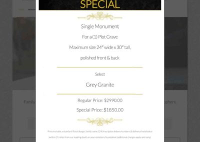
The use of eCommerce was implimented to create an online catalog. Instead of showing prices the client requested the need for ‘general ideas’ of the different types of monuments and memorials available. Items were broken down into types of materials, shapes, lettering, sizes and extras. The look of the site was to be simple and respectful while promoting various means of contact for questions.
From the initial launch to the improved CMS converstion, the sitre traffic has maintained a constant steady growth over the years.
Client
Charles DeChristopher Jr.
Services
HTML to CMS Conversion
Website Re-Design
WordPress Build
Theme Development
eCommerce Integration
Catalog / Inventory Creation
Deliverables
Brand Identity
Copywriting
Creative Direction
Photography / Images
3D modeling
Graphic Design
Logo Re-Design
Business Media
Google Business
Website Development
Other
SEO
Analytics
Google Maps
Maintenance
Creation & Hand Off
Site Images —
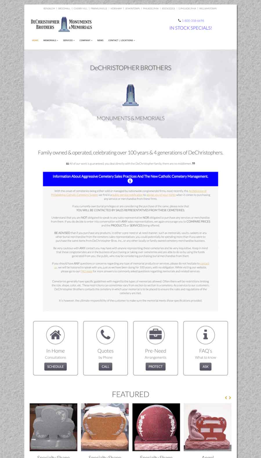
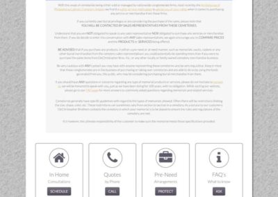
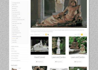
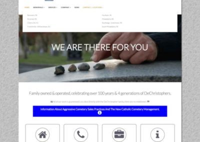
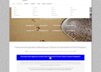
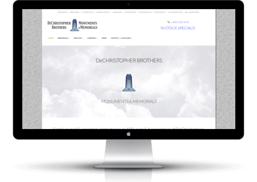
The site was set in a boxed layout with a granite background. Soft colors with blue as the attention getter run throughout the pages. The main page has a slider that reinforces the company’s beliefs and message. Areas of focus are bordered to separate them from content and make them noticable. In the catalog section, easy navigation has been placed to the left of every page. The main section has a large image with a description of the type of memorial. Some 3D models were created for the cataloging for quick recognition of the type and material.
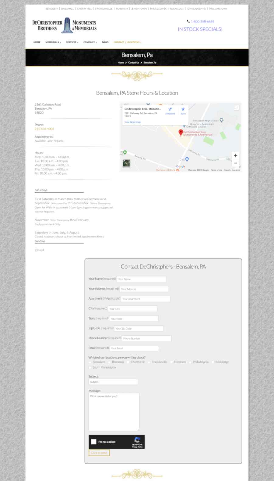
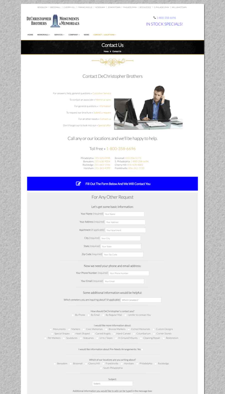
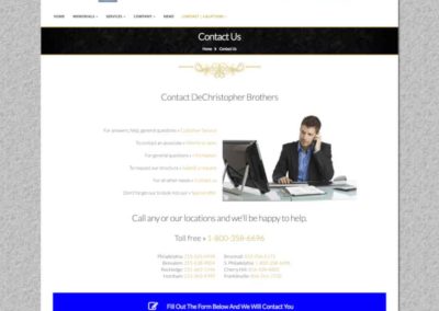
The contact page has an extensive form for specific needs and listings of all branch phone numbers. A top menu has quick links to each store location. Each location displays an active map, information, hours and a contact form tailored to that location and its services. All of the pages are arranged in an easy to read drop down menu. With a mind on the age range of the traffic that will be using the site.
Additional Notes On Project —
Its been wonderful to watch this site develop from a three page ad into the standard of the community it serves. The dozens of testimonials people writie thanking them for their attention to details is very impressive. It was a pleasure to develope this site and then hand it over to the company’s IT department.
